
Chole! is a 19-year-old typeface and a vibrant rising star in the international table tennis scene, known for their funky fashion taste and creative playing style.
1 Styles
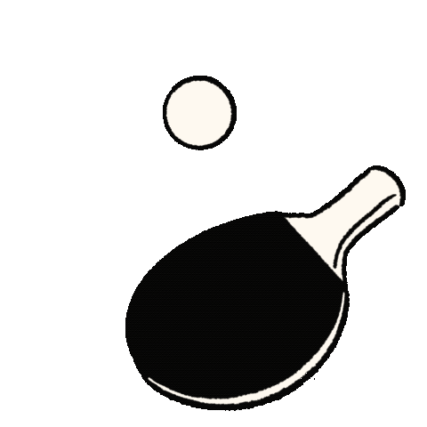
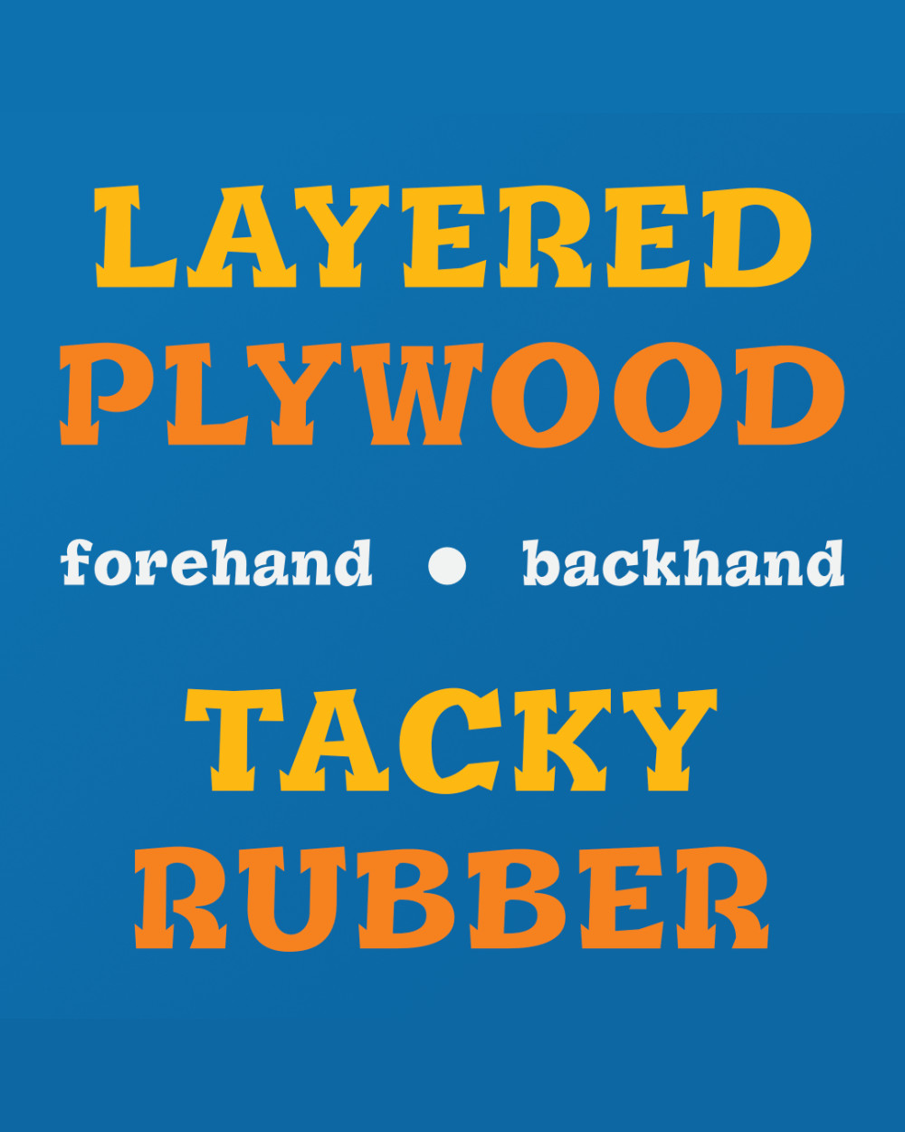
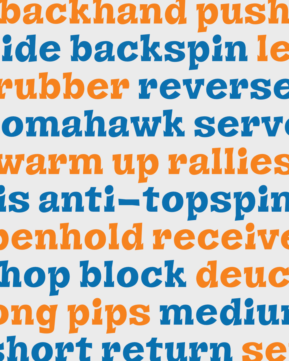
As a traveling superstar, Chole!’s suitcase is their lifeline, holding both their prized racket and unique wardrobe. With an early focus on personal style, they design and develop their own clothing brand on the go, crafting new pieces between competition stops. As a lefty penholder, Chole! plays with a dark plywood blade glued to neon-orange and grey rubbers. Accordingly, their distinctive fashion taste blends oversized tops and sporty socks with formal pants and shoes.

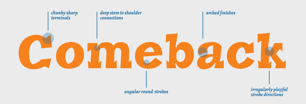
At first glance, Chole! appears to be a contradiction: disciplined yet flamboyant, methodical yet instinctive. Behind the spectacle lies a carefully engineered identity—one forged through repetition, setbacks, and an unusually analytical mind.
Chole! grew up in a compact coastal city where space was scarce and ambition had to be inventive. The first training hall was not a national centre but a converted warehouse with uneven flooring and flickering fluorescent lights. There, long before international recognition, they learned to improvise. When proper training robots were unavailable, they built makeshift drills using taped targets and old return boards. From the beginning, experimentation defined their development.
Coaches quickly noticed an uncommon spatial awareness. Chole! seemed to “read” the geometry of rallies, calculating angles and timing with typographic precision. While peers relied on brute repetition, Chole! kept detailed notebooks—mapping serve variations, spin differentials, and opponent tendencies like a designer cataloguing letterforms. This analytical habit would later become one of their competitive advantages. Chole!’s playing philosophy is rooted in asymmetry. Rather than dominate through sheer power, they manipulate rhythm. Matches often unfold like carefully composed layouts: open space, sudden compression, unexpected shifts in tempo. Opponents frequently comment that rallies against Chole! feel disorienting—not because of overwhelming speed, but because of deliberate unpredictability.
At seventeen, a wrist overuse injury threatened to stall progress. The pain was subtle at first—a dull stiffness during warm-ups. Ignored for months, it eventually escalated into inflammation severe enough to withdraw from a major continental event. The rehabilitation period became transformative. Unable to train fully, Chole! redirected energy into biomechanics study and strength conditioning. They worked with a physiotherapist to rebuild forearm resilience and adjusted grip pressure to reduce strain. During this phase, mental resilience deepened. Watching tournaments from the sidelines sharpened their strategic eye; matches became case studies rather than missed opportunities.
Chole! dreams of one day becoming the official custom typeface of WTT (World Table Tennis), appearing in their event marketing campaigns and media worldwide. Until then, they find comfort being embossed on prestigious racket rubbers and featured on anything table tennis related—from playing kits and nets to table vinyl prints and venue adverts.

TOP SEED PLAYER
Fun fact: Chole! prefers black-toned tech devices—like phones, earbuds, and laptops—to create a sharp contrast with their colourful clothing.